SAMSUNG · BUNDLES
The brief: To give Flip and Fold5 buyers one place to see all of Samsung’s latest products together, allowing them to trade in, bundle products for discount and browse features before buying. I worked closely alongside our UX and development teams to design every aspect of the UI and interactivity brought to life on the front end.
The brief: To give Flip and Fold5 buyers one place to see all of Samsung’s latest products together, allowing them to trade in, bundle products for discount and browse features before buying. I worked closely alongside our UX and development teams to design every aspect of the UI and interactivity brought to life on the front end.
The brief: To give Flip and Fold5 buyers one place to see all of Samsung’s latest products together, allowing them to trade in, bundle products for discount and browse features before buying. I worked closely alongside our UX and development teams to design every aspect of the UI and interactivity brought to life on the front end.
LANDING
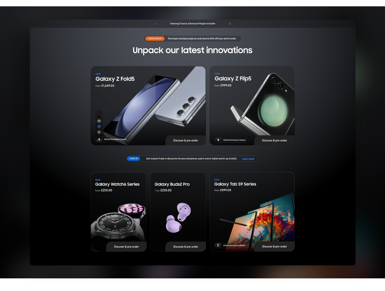
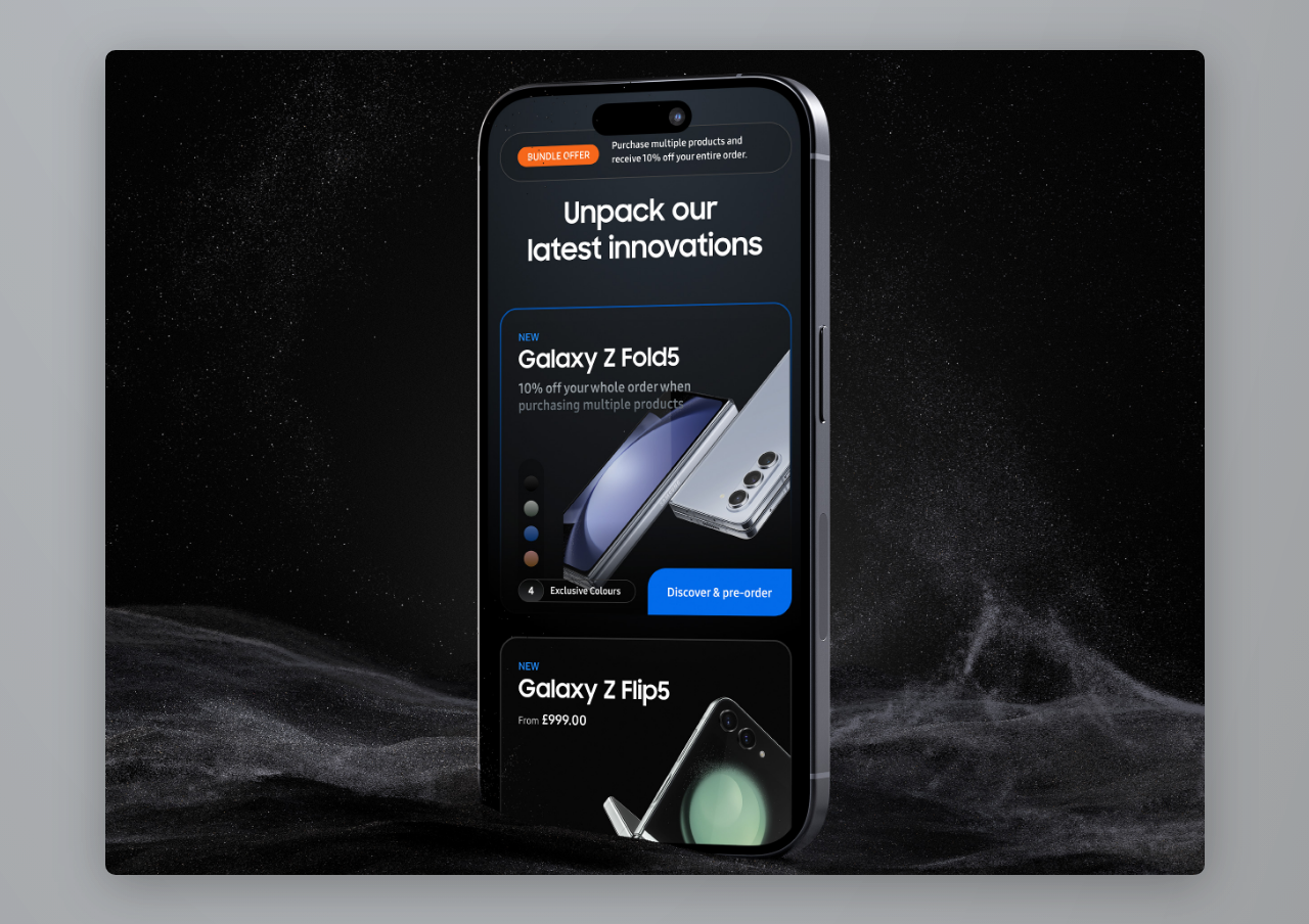
On landing the user is presented with Samsung’s flagship products and prompted to discover and pre-order. The challenge of a page like this is to balance pleasing aesthetics with the need to communicate often complicated offer and pricing information.
On landing the user is presented with Samsung’s flagship products and prompted to discover and pre-order. The challenge of a page like this is to balance pleasing aesthetics with the need to communicate often complicated offer and pricing information.
CONFIGURATION
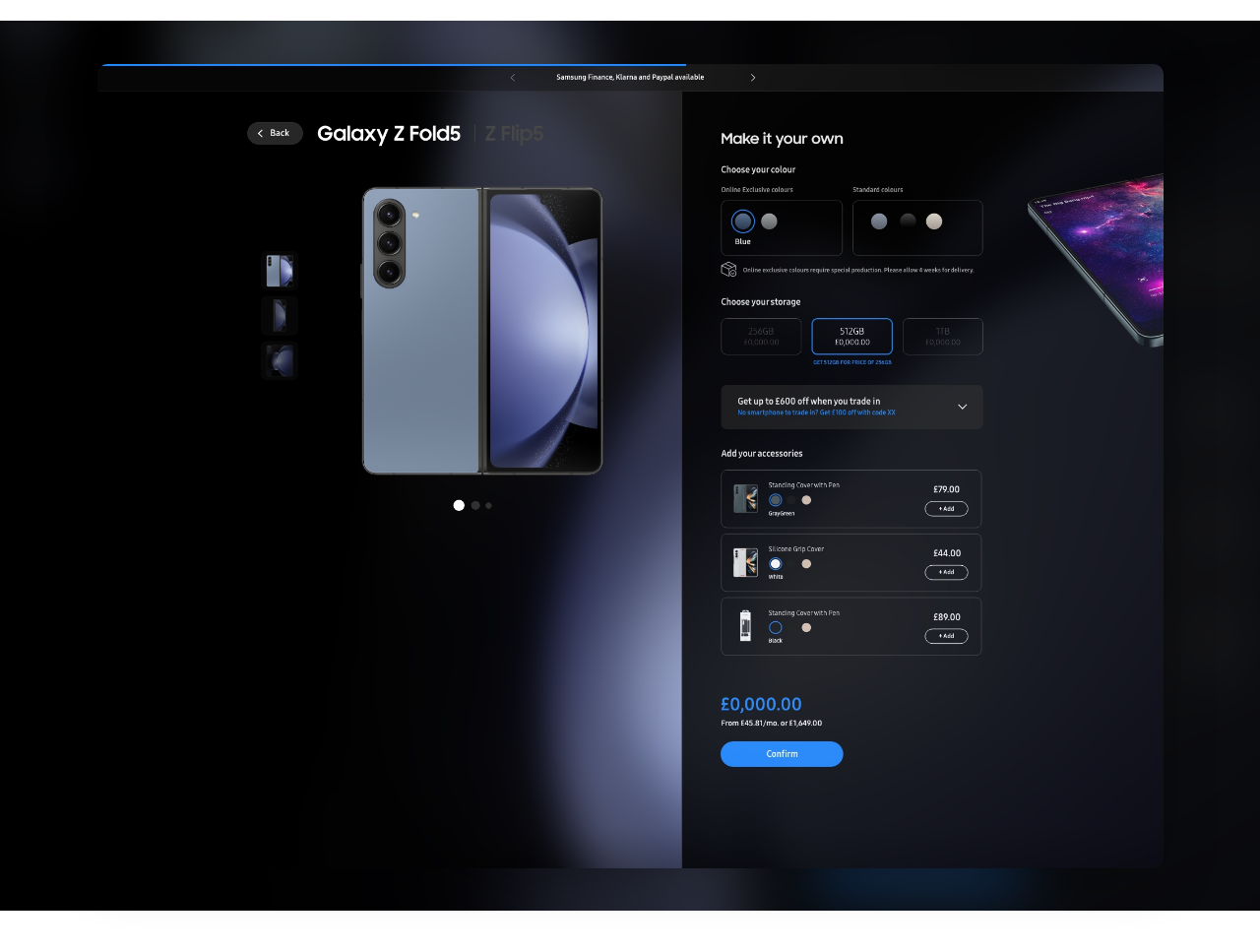
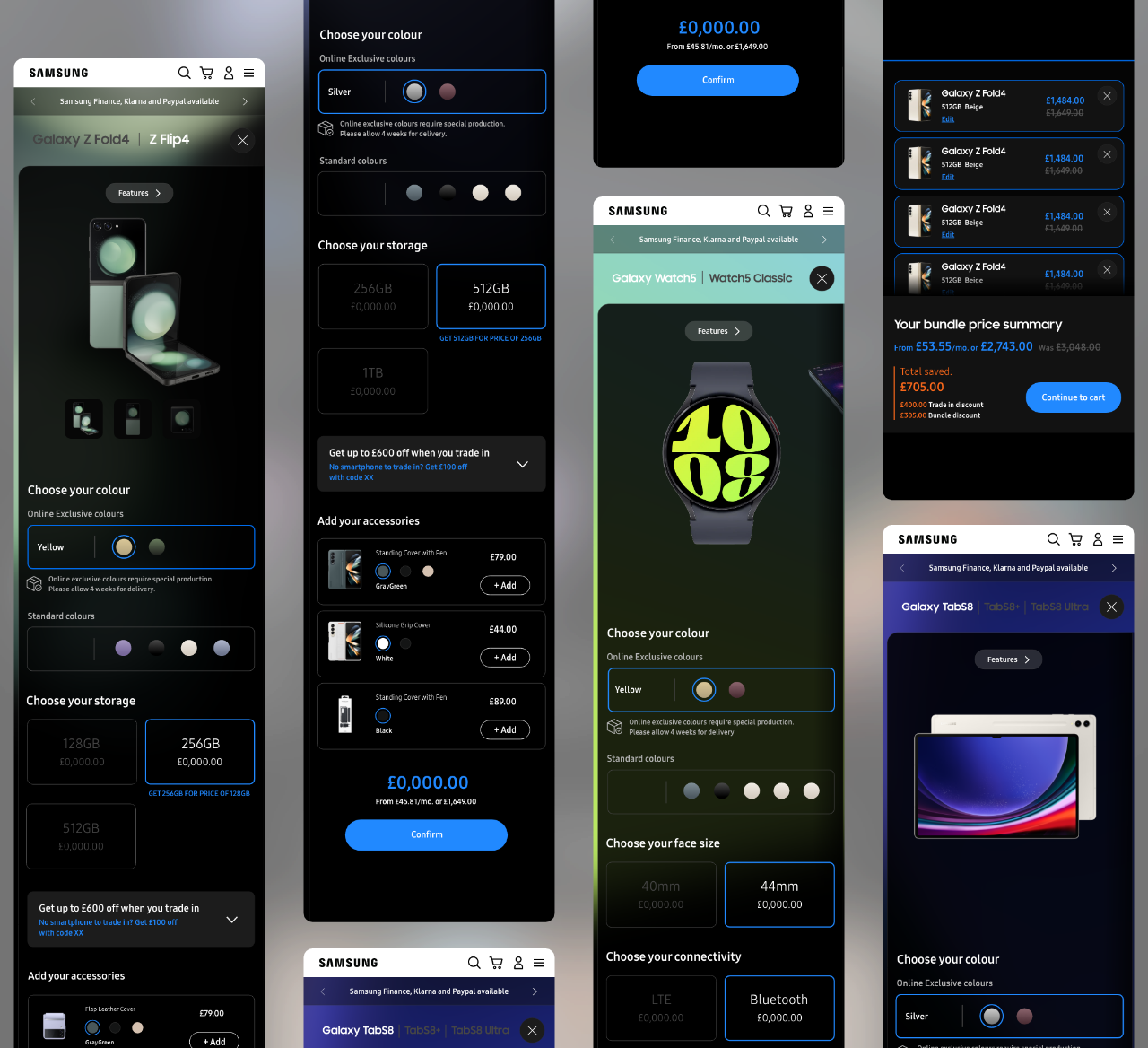
Clicking on the “Discover & Pre-order” CTA slides over that products configuration page. Here, our user can edit their device features like colour and storage, trade in their old device and add accessories to their basket.
Clicking on the “Discover & Pre-order” CTA slides over that products configuration page. Here, our user can edit their device features like colour and storage, trade in their old device and add accessories to their basket.
SUMMARY BASKET
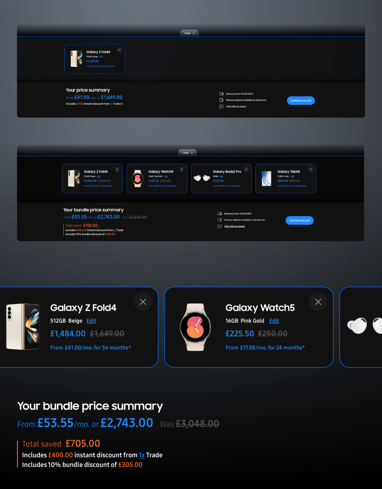
Our Summary basket had to give our purchaser all they needed in order to make an informed decision, at the same time we had to have it as discreet as possible.
Our Summary basket had to give our purchaser all they needed in order to make an informed decision, at the same time we had to have it as discreet as possible.
FEATURES
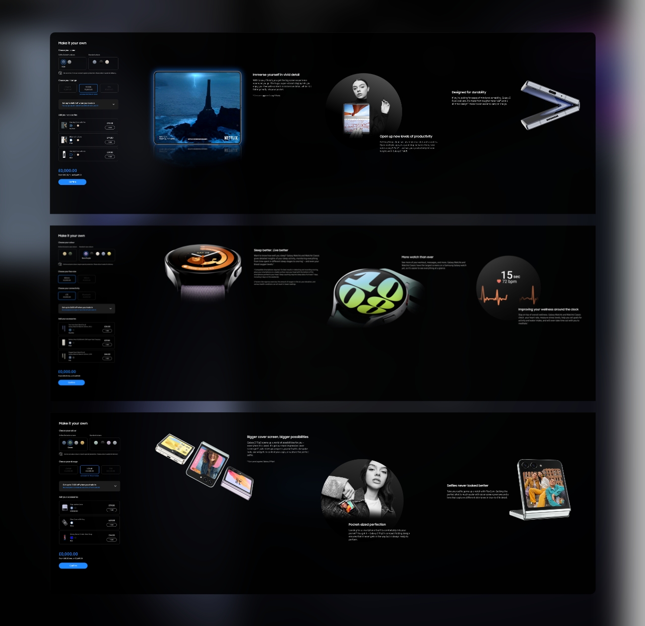
We showcased the top three features per product on a horizontal scroll, keeping the images bold and the copy short for impact.
We showcased the top three features per product on a horizontal scroll, keeping the images bold and the copy short for impact.
MOBILE
The mobile experience needed to be light, fast, offer the same best in class messaging and get users to purchase as simply as possible.
The mobile experience needed to be light, fast, offer the same best in class messaging and get users to purchase as simply as possible.
DESIGNING THE SYSTEM
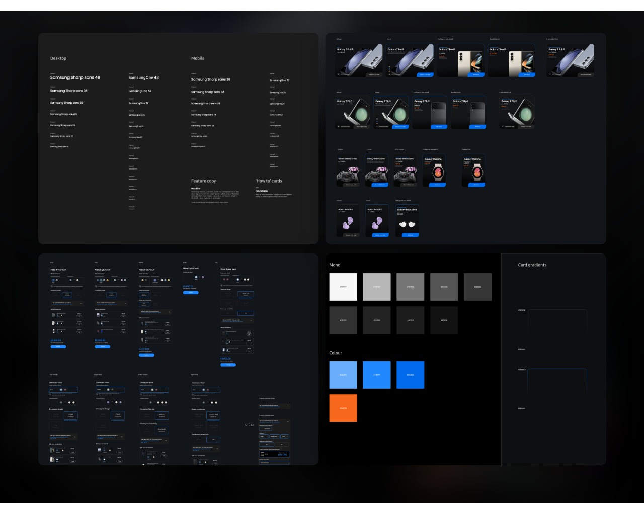
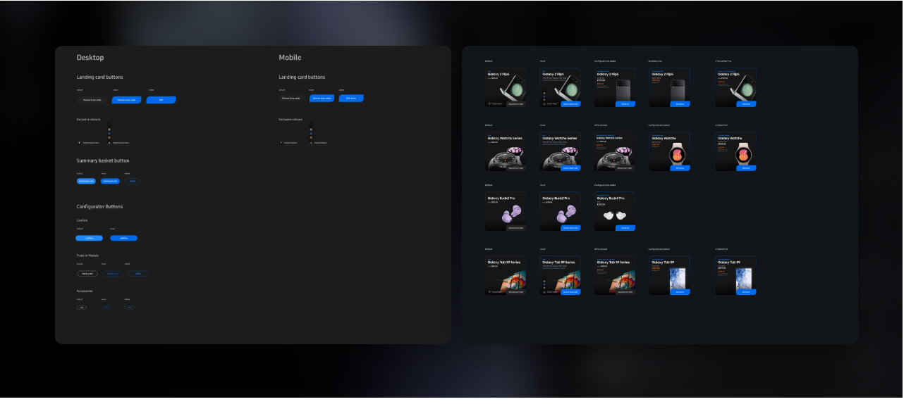
The crucial first step was embarking on this system. Given that there were multiple purchasing states, offers, trade-in values and discounts. Anticipating change requests and relying on a system that could take that load was vital.
The crucial first step was embarking on this system. Given that there were multiple purchasing states, offers, trade-in values and discounts. Anticipating change requests and relying on a system that could take that load was vital.
CONTRIBUTION
Animation · UI & UX design · Art Direction
Animation · UI/UX design
· Art Direction
CREDITS
Agency · Cheil
Producer · Thomas White
UX · Stephen Dunne
Copywriter · Andrea Petrou
Dev · Michael Duffy
Agency · Cheil
Producer · Thomas White
UX · Stephen Dunne
Copywriter · Andrea Petrou
Dev · Michael Duffy
Agency · Cheil
Producer · Thomas White
UX · Stephen Dunne
Copywriter · Andrea Petrou
Dev · Michael Duffy
©2025 Objective Measure · Michael Pauls